

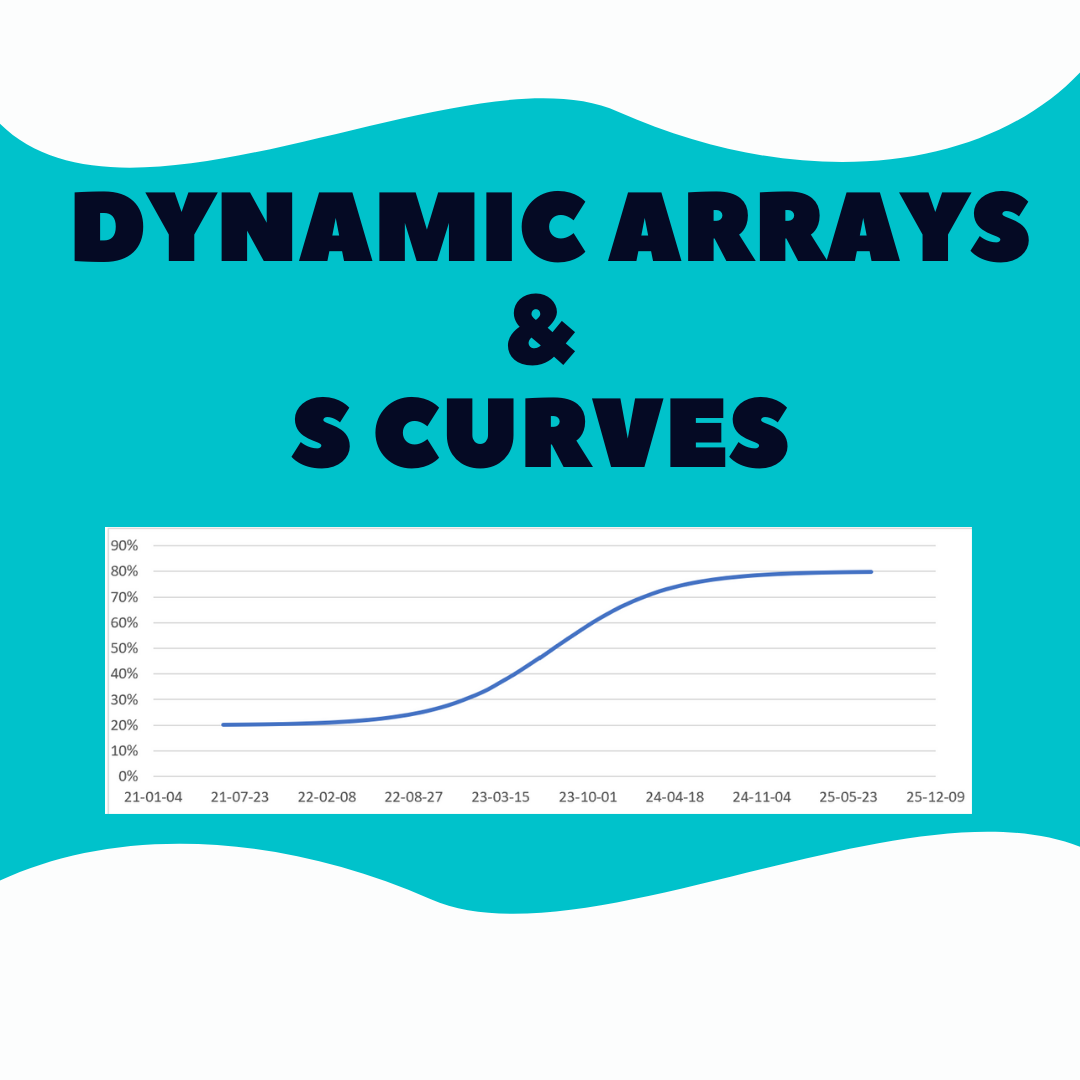
I played around with two different S curve concepts using dynamic arrays.
What is an S curve?
Related to Excel I found two concepts. In the end, both create a line that resembles an S when plotted against time.
Project management: tracks allocated costs over time. Estimate ahead of time or track as it happens. Often ends up looking like an S curve.
Formula generated: uses inputs & formulas to directly create an S curve.
Dynamic Arrays
Each Excel file is based on a source, video & xlsx, that were created without dynamic arrays:
project management: video from Insights Training (how to build it)
formula generated: Excel file from clearlyandsimply
In both cases I modified the concept/file to work with dynamic arrays!
Excel Files
The 2 Excel files based on file & video from Insights Training & ClearlyandSimply but modified by me to work with dynamic arrays.
Now I will review each file.
S curve via inputs_.xlsx
The Excel file from clearlyandsimply was great! I replaced various formulas with dynamic arrays so that increasing or decreasing the value in cell B4 automatically changes the amount of rows.
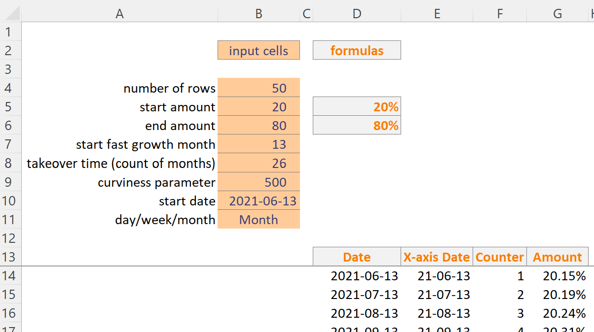
‘Date’ formula:
Select a time unit in cell B11. I used scenario manager to add sample data for each time unit (eg day data doesn’t work if month is selected).
This formula uses dynamic array SEQUENCE to spill the date values down.
=IF(B11="Month",DATE(YEAR(B10),MONTH(B10)-1+SEQUENCE(B4,1,1,1),DAY(B10)),
LET(dateval,DATE(YEAR(B10),MONTH(B10),DAY(B10)),
SEQUENCE(B4,1,dateval,IF(B11="Day",1,IF(B11="Week",7,"")))))
‘X-axis Date’ & ‘Counter’ formulas are simple. Let’s skip to ‘Amount’.
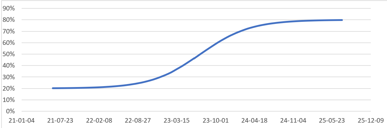
‘Amount’ formula:
Creates the line on the chart. ClearlyandSimply has a great explanation here of how it works.
Original formula from clearlyandsimply Excel file:
=myStartValue+(myTargetValue-myStartValue)/(1+myCurviness^((myStartofFastGrowth+myTakeoverPeriod/2-D13)/myTakeoverPeriod))I modified it to spill downwards automatically due to F14# spill syntax:
=IF(F14="","",$D$5+($D$6-$D$5)/(1+$B$9^(($B$7+$B$8/2-F14#)/$B$8)))S curve via expenses.xlsx
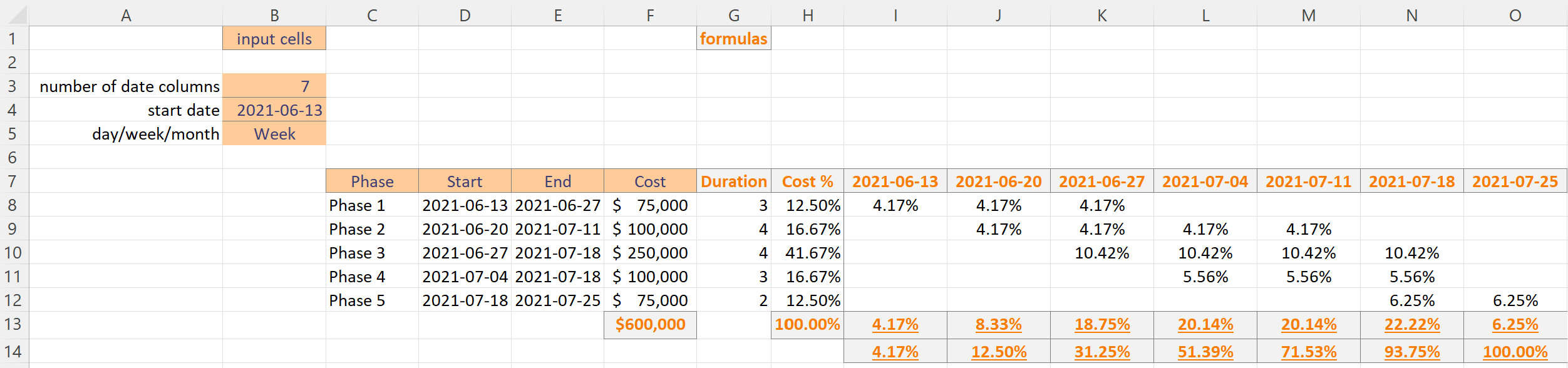
Column C has phases (could be costs). As the project ramps up the costs increase and then start to tail off. On a chart the line looks like an S.
Select a time unit in cell B5. Again, I used scenario manager to load sample data for each time unit.
Cell I7 has this formula that spills to the right as far as necessary:
=TRANSPOSE(IF(B5=”Month”,DATE(YEAR(B4),MONTH(B4)-1+SEQUENCE(B3,1,1,1),DAY(B4)),
LET(dateval,DATE(YEAR(B4),MONTH(B4),DAY(B4)),
SEQUENCE(B3,1,dateval,IF(B5=”Day”,1,IF(B5=”Week”,7,””))))))
The other formulas below don’t spill to the right. Could I somehow update them to also spill right?
The chart range is: =data!$I$14:$O$14
Chart Options
For the charts In both Excel files I changed various options. It was really late at night on Saturday and I was in the zone. But now, I can’t remember everything I did and I’m lazy to audit and document it all. So, I’ll leave it to you as homework to audit them so see what I changed 🙂
Recap
This was fun to explore. The key formula from clearlyandsimply is amazing. It makes the line start slow, increase sharply, and then tail off. The video from Insights Training is great. It shows step by step how to create an S curve based on expenses (or projected expenses).
Modifying their files to use dynamic arrays (sequence function) was a good challenge.
About Me

My name is Kevin Lehrbass. I’m a Data Analyst and I live in Markham Ontario Canada.
If you haven’t noticed I like playing around in Microsoft Excel.