


I keep hearing “flatten the curve” during these uncertain times of covid-19. What’s that? What do we do? Also, what can we do to reduce anxiety? For me I decided to create a “flatten the curve” demo in Excel and in Power BI 🙂
Slow It Down
Washing hands, staying home, etc slows down the spread which flattens the curve, relieves pressure on hospitals and saves lives. Let’s all do our part.
Flatten the Curve Viz
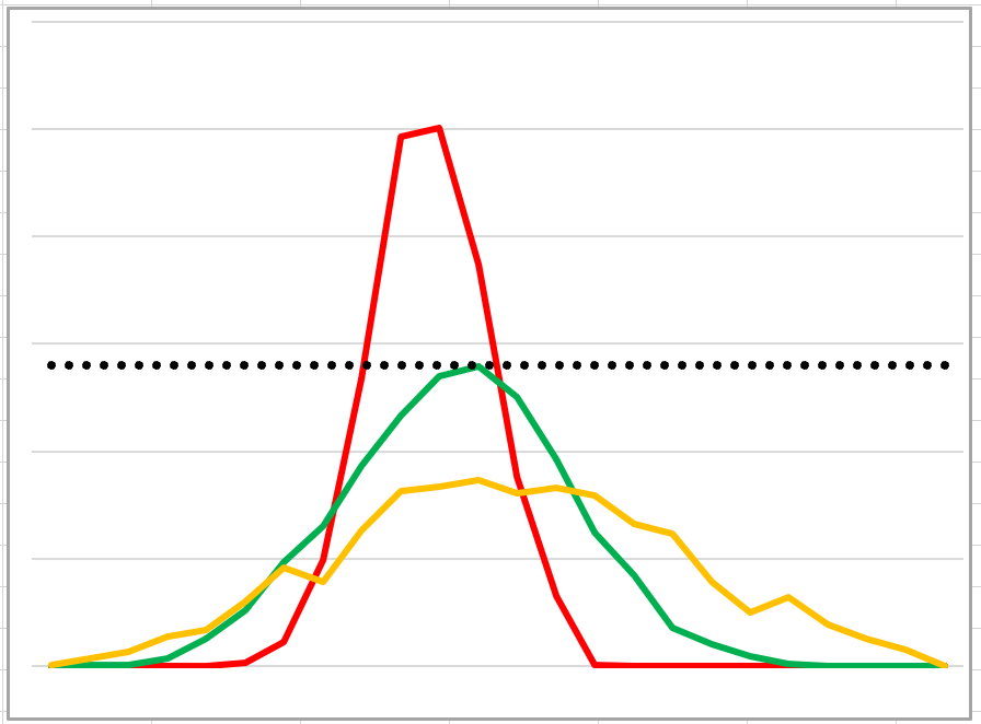
We’ve seen the chart on the news. Here’s one from CBC news:

The health care system is limited (dotted constant line). We need to reduce the height of the red curve so it fits within health care system capacity.
Excel Demo
Download my Excel file (save to computer and then open it).
My formulas create fake demo data for 2 bell curves. The red one quickly spikes upward and past the health care dotted line while the green one (based on our positive actions) doesn’t peak as high and spreads out more to the right.
NORM.INV function
![]()
NORM.INV function creates the bell curves. It has 3 arguments:
‘mean’ and ‘standard_dev’ define the curve’s dimensions. ‘mean’ is the average of all the numbers and ‘standard_dev’ defines the spread of the data-set. A big number = a big spread (flatter), a small number = a peak around the mean.
‘probability’ creates a value within this dataset.
NORM.INV Formula
=NORM.INV(RAND(),$B$2,$B$3) depends on variables in cells B2 and B3. RAND function creates a random value within our data-set. If we drag this formula down far enough we’ll have a smooth curve clustered around the mean.

Binning the Numbers
I created groups (aka binning) to make it easier to read the data.
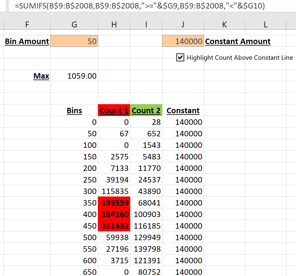
Finally I created the chart that we saw above. Don’t forget that the data changes due to the volatile RAND function…and feel free to play around with the ‘mean’ and ‘standard_dev’ variables.
Power BI
Download my pbix file.
To make it interesting I decided to create everything in Power BI. No external data allowed!
I researched the DAX to create bell curve numbers. But it’s not possible to create a measure until we have a table!
How can we create a table without importing data? I used table function GENERATESERIES.
On the ribbon click ‘Modeling’ and ‘New Table’ then enter this DAX and press enter:
Table1 = GENERATESERIES(1,2000,1)
Click the ‘Data’ icon on the left side of the screen to see our new table! It has one field called ‘Value’ with 2000 rows.
Add DAX helper columns to create bell curve data.
As there’s only 1 table new columns are automatically added to Table1. Click ‘New Column’ and add DAX below:
BellCurve1 = ROUNDDOWN(Norm.inv(rand(),300,60),0)
BellCurve2 = ROUNDDOWN(Norm.inv(rand(),300,100),0)
Making the Chart
Hover over field BellCurve1. On right side click the 3 dots and select ‘New Group’. Change bin size to 50, press ‘Ok’.
Drag new column ‘BellCurve1 (bins)’ into the canvas. It should default to a Clustered Column Chart.
Add ‘BellCurve1’ to the Value area. With the chart selected, select ‘Line Chart’. Add ‘BellCurve2’ to the Value area.
Add constant line: Under Visualizations click magnifying glass (Analytics), ‘Constant line’, ‘Add’, with value of 200000.
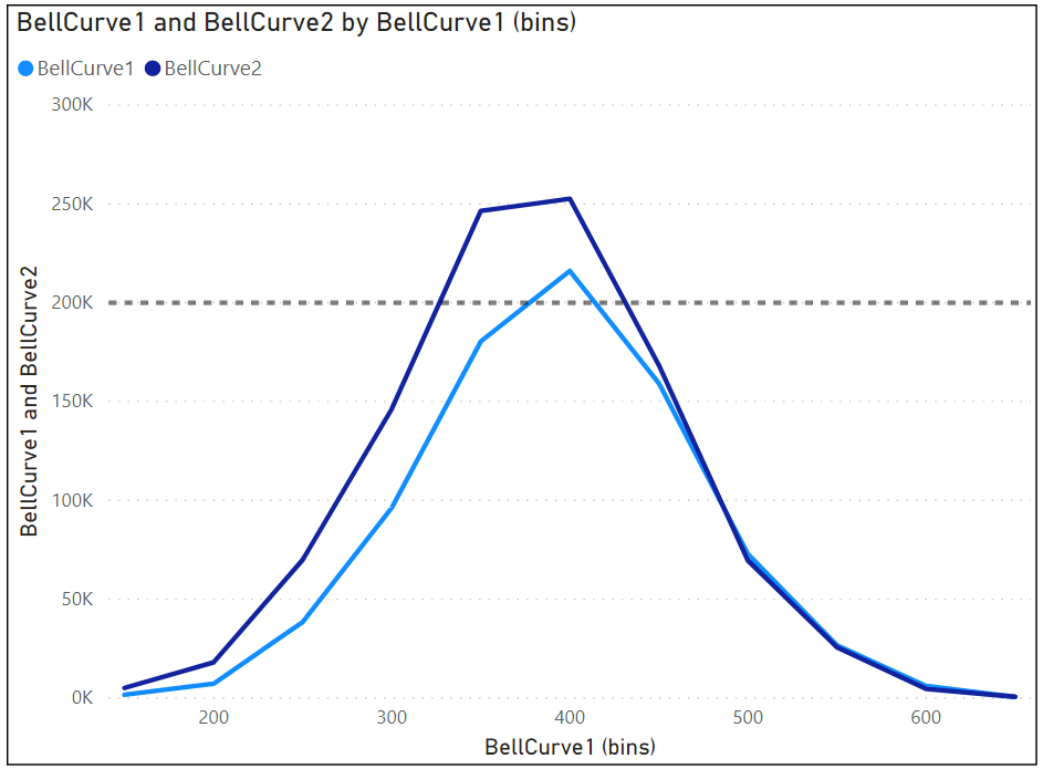
Here’s the Power BI demo chart. Remember that it’s based on RND (random) so it changes.
Make Table Alternative #1
GENERATESERIES is amazing but it’s not the only way. I created the same table (1 counter column) in Power Query!
- Open Power Query: On the ribbon select ‘Home’ and ‘Transform data’ (could be ‘edit queries’ in your version)
- Home / New Source / Blank Query
- In formula bar paste this code: =List.Numbers(1,2000,1)
- Top left click ‘To Table’ and press ‘ok’
- M code looks like this: = Table.FromList(Source, Splitter.SplitByNothing(), null, null, ExtraValues.Error)
- Top left click ‘Close & Apply’
Make Table Alternative #2
This DAX method is longer than GENERATESERIES but it’s interesting and worth reviewing.
I could use CALENDAR function to create a new table. On ribbon: Home / New Table:
zTable = CALENDAR(1,2000)
Yes, it creates a new table but it has 2000 dates and we want numbers 1 to 2000. I tried to wrap CALENDAR function with INT function but that didn’t work (probably because CALENDAR is a table function not a column).
So, wrap CALENDAR function with SELECTCOLUMNS to convert dates to integers. SELECTCOLUMNS has 3 parts:
- a table: CALENDAR( MINcounter, MAXcounter )
- a column name: “xNumber”
- an expression: INT([Date])
The DAX code in Table2 creates a table with 1 column named ‘Date’ and 2000 rows.
Note: I used variables (VAR) to store min and max numbers later used inside CALENDAR function. Not a big difference but in longer DAX statements using variables makes it so much easier to read.
Positive Distractions
Creating the excel file, pbix file and writing this post really helped me focus on something else besides you know what. I don’t know everything about Excel but I’ve used it for many years. The real challenge was researching the M and DAX code and implementing it in Power BI. I have a fair amount of theoretical knowledge but hands on building is essential.
More positive distractions include watching:
- Big Bang Theory
- Two and a Half Men
- Seinfeld
- Men in Black 3
We need to be informed but we can’t worry constantly. What are you doing to have fun or distract yourself?
About Me

My name is Kevin Lehrbass. I’m a Data Analyst and live in Markham Ontario.
Hopefully we’ll look back at the Covid-19 crises saying things like “I’m glad we took those steps to slow it down”. Time will tell.
Here’s a post about standard deviation based on height. It proves that I’m not always a freak. It depends on my location.