

One of Microsoft Excel’s most prolific features is the Pivot Table. Pivot Tables offer an efficiency and effectiveness in making sense of large amounts of data in almost no time. With that in mind, we now turn our attention to a scenario where we will create a Pivot Table in five minutes.
(this is a guest post from Kasper and Mikkel at spreadsheeto.com)
OUR SCENARIO
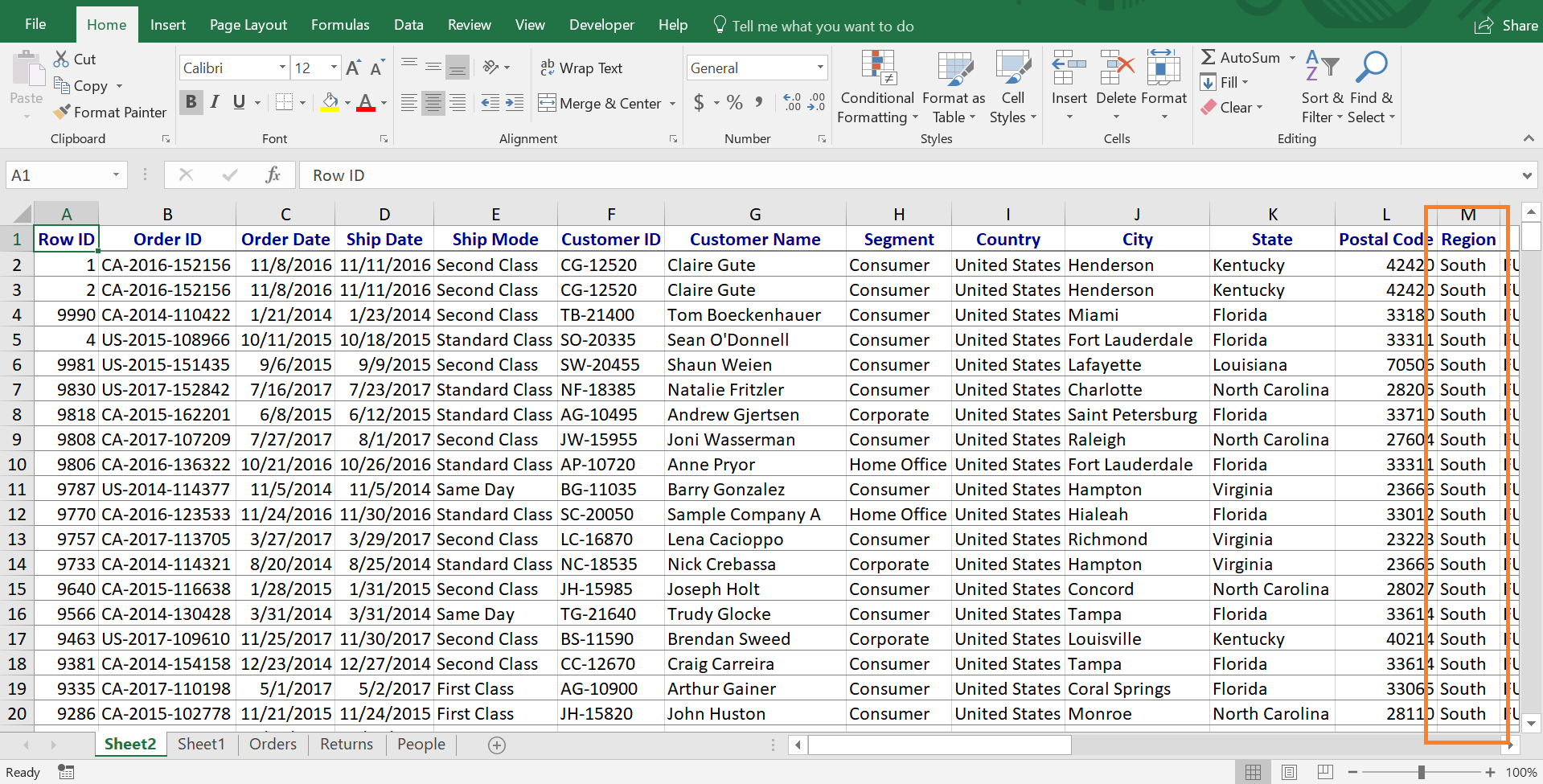
Your manager has asked you to analyze an Excel file containing over nine thousand rows of data. Your instructions are to identify trends and abnormalities in the data and have it done as soon as possible.
A pivot table can help us with a project like this! Pivots provide us with an efficient way to analyze and summarize parts of the complete set of data. Let’s build a Pivot Table!
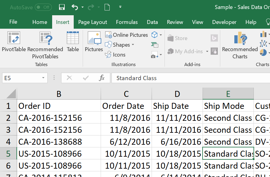
THE DATA
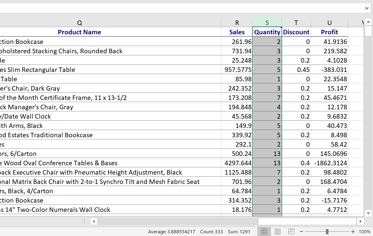
Let’s look at our sales data. First, make sure all your columns and rows are contiguous data. This means no columns without a header value and no blank columns or rows. Think of each column as a different thing and each row as an entry or transaction.

ACTIVATE PIVOT TABLE
There are several different ways to activate a pivot table:
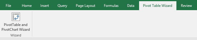
1) Activate the pivot table wizard by pressing the following keys in consecutive order: alt + D + P.
2) Navigate to the Pivot Table Wizard tab and select PivotTable and PivotChart Wizard.
3) If you’re using the latest version of Excel, included as part of Microsoft Office 365, you can access the pivot table toolbar on the ribbon labeled “Insert” and click “PivotTable”.
PIVOT TABLE SET-UP
Now, you should see either (a) pivot table wizard or (b) a dialog box:
(a) pivot table wizard
The wizard will ask you the following questions. For our first pivot table, we’ll keep the default option.

(b) pivot table dialog box
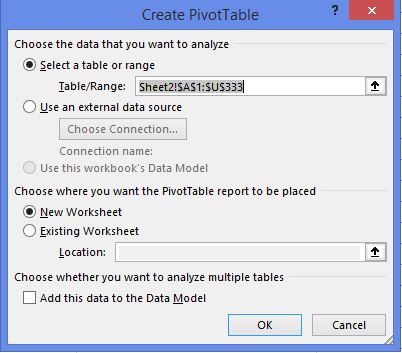
If your data range is correctly detected you can now click ‘Next’ or ‘OK’. If not, manually select your data and then proceed.
WHERE DO WE PUT THE PIVOT TABLE?
“new worksheet” or “existing worksheet”
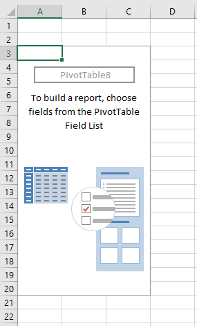
Both methods, wizard and dialog box, will ask you where to put the pivot table. The best option is to place the pivot table in a new worksheet. This helps to maintain the integrity of your data. Either way, click ‘Finish’ or ‘OK’. You should now see an empty pivot table.
PIVOT TABLE LAYOUT
Depending on your Excel version you’ll see one of these:
Classic pivot layout
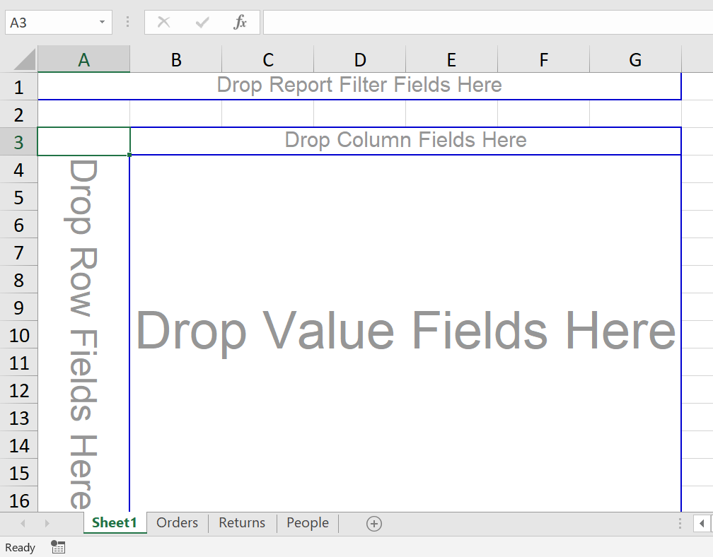
New pivot layout
Change to classic layout?
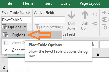
If you see ‘New pivot layout’ and you prefer ‘Classic pivot layout’ you can change it:
Go to the PivotTable group on the Analyze tab (while a cell within the PivotTable region is selected)

Now click on Options and select Options from the drop down.
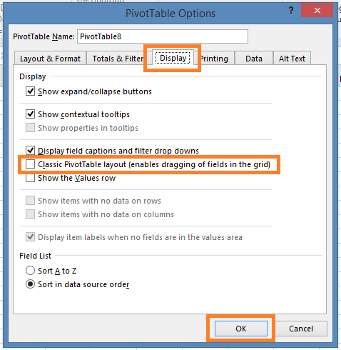
This opens the PivotTable Options dialog. Select ‘Display’ tab and check the box next to ‘Classic PivotTable layout (enables dragging of fields in the grid).’ Click OK, and you should be set.
PIVOT TABLE TOOLS
We’re almost ready to start slicing and dicing the data! But first, let’s look at some key pivot table tools.
After the pivot table is created Excel will reveal a workbench containing tools specific to pivot tables. These are found on the Analyze tab (which is only visible while you have the PivotTable grid region selected).
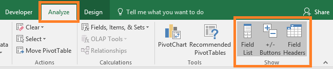
The tool that we will use the most is the pivot table field list. The field list can be moved and resized to your preference. The field list can be used to quickly identify the data fields inside the spreadsheet, which represent the columns from your source data.

USING PIVOT TABLE FIELDS
Think of a pivot table as a canvas where you can add different fields from your data. It varies a bit depending on the layout you’re using:
Classic pivot layout
- Select the “Category” field from the field list and drag / drop it into the Row Field.
- Select the “Region” field and drop it into the Column Field.
- Select the “Quantity” field from the field list and drop it into the Value field.
New pivot layout
- In the field list check “Category”. It should now appear in the Rows area (or drag drop “Category” into Rows below).
- Drag and drop “Region” into the Columns area below.
- Drag and drop “Quantity” into the Values area below.
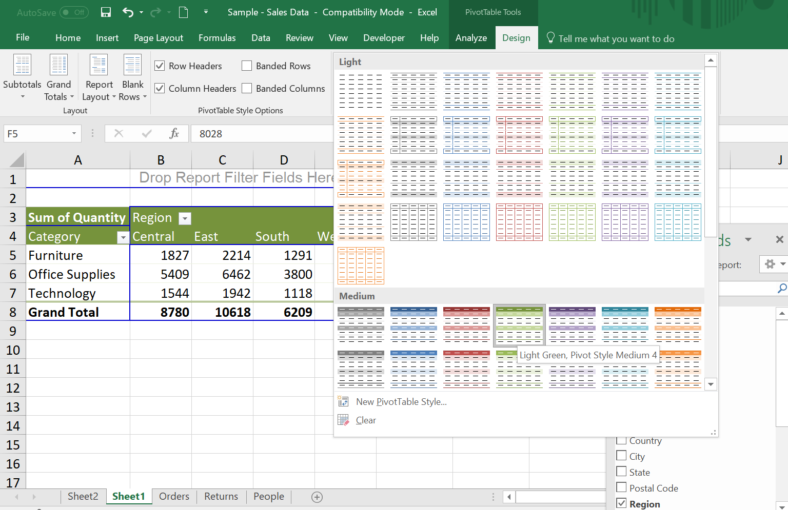
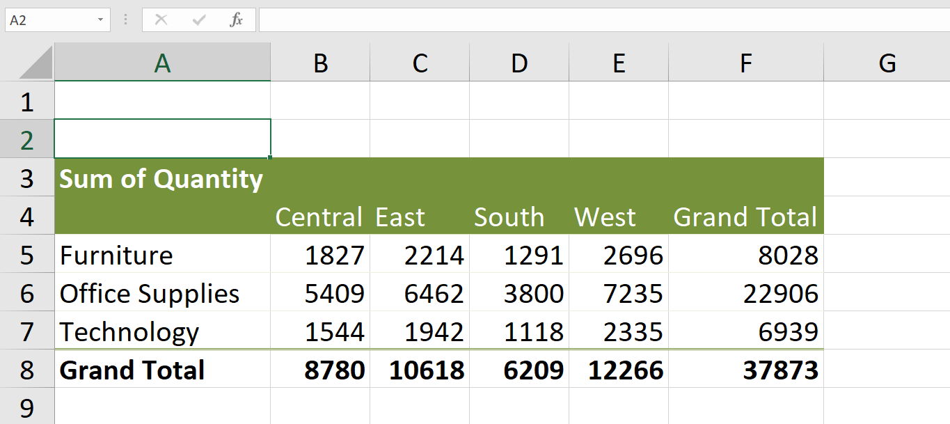
Within a few steps, we’ve created a Pivot Table! We’ve inserted over nine thousand rows of data into an efficient presentation summarizing the quantity of each category of goods sold per region.
DISSECTING PIVOT TABLE DATA
(please note: this section is optional. You can skip this and scroll down to PIVOT TABLE FORMATTING)
Let’s use the same pivot to dissect our data.
Example: As seen below, cell D5 is the intersection of Category=Furniture and Region=South. The value is 1291.
Double left click cell D5 and you will see a new sheet with the rows of data that were used to calculate 1291.

We have extracted the underlying data without affecting the original data source.
Are you one of those individuals where “seeing is believing”?
This pivot extract (Category=Furniture, Region=South) can be reconciled by adding the numbers in column ‘Quantity’. Total = 1291 (same as our pivot).
PIVOT TABLE FORMATTING
Let’s format our pivot table and use it to prepare a report which summarizes the sales order activities.
Excel provides unique design options that can be applied to your pivot table.
- Activate the pivot table by clicking a cell inside its region.
- From the pivot table menu, select ‘Design’ tab.
- Select any option available in the list. The format is applied to the entire pivot table consistently.
Further customize your pivot by adjusting the headers and fonts used inside the pivot table. Field labels can be hidden or visible using the ‘Field Headers‘ button.

This option feature removes the field labels giving your pivot table a customized presentation.
CHANGING THE CALCULATION TYPE
In the pic above it says ‘Sum of Quantity’. If a field contains only numbers a pivot table defaults to ‘Sum’ (adding) but we can change this using ‘Value Field Settings‘
- select any cell in the pivot
- right-click on your mouse or trackpad
- select ‘Value Field Settings’
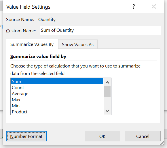
You can now change the calculation type. (Note: alpha-numeric fields default to Count calculation type).
PIVOT TABLE NUMBER FORMAT
We can also use ‘Value Field Settings’ to change the number format. As seen above, click ‘Number Format’. The pic below shows the formatting options. Let’s use the Number format with two decimal places.

Now we have a pivot table with all the custom features we chose.

With these examples, you can begin to see what is possible with pivot tables. This quick intro barely scratches the surface of what is possible. However, the scenario is common yet thorough enough to demonstrate the amount of data that can easily be summarized and visualized in just a few steps.
For a deeper dive, check out the comprehensive guide on Pivot Tables at https://spreadsheeto.com/pivot-tables/.
ABOUT SPREADSHEETO

Spreadsheeto is run by Kasper Langmann and Mikkel Sciegienny from Denmark.
They have an interesting story. They’ve been friends since nursery school all the way through public school, high school and university.
I bet they’ll also end up at the same retirement home some day! Read their full bio here on their site and check out their Excel training!
ABOUT ME

My name is Kevin Lehrbass. I live in Markham Ontario Canada and work in Toronto as a data analyst.
I’ve been working with Excel and databases since 2001. I’ve built a career around knowing SQL and Microsoft Excel.
Data is everywhere these days. Long gone are the days when only one department would handle the data. It’s so much fun and there’s always something new!
I know of the pivot table wizard and keyboard shortcut. But never seen this tab before, is it just a custom tab?
Hi John,
I had the same question. It might be from a different version of Excel or as you said a custom tab. I use Excel 2016 and I can’t find this. I’ll ask Kasper and Mikkel. Thanks for visiting my site John.
Cheers,
Kevin